It’s 2018, and Google is making a change that adds yet another important factor in the ever-changing web of their search engine algorithm. Google has begun rolling out its mobile-first index, which ranks and creates search listings based on mobile optimized versions of websites. Desktop users also see the same listings as mobile users.
The move isn’t very surprising, since the number of mobile internet users is constantly increasing. People can’t carry their desktops around everywhere, so they read content and make searches on the go through their smartphones.
Why Mobile Matters
Time spent on mobile media is steadily increasing, while time spent on other forms of media and devices is steadily decreasing, according to eMarketer statistics. Even longer content such as ebooks are increasingly read on smaller, mobile devices, with 54% of people who buy eBooks reading them on their phones. The same goes for other forms of long content. This is what led to the more widespread rollout of Google’s mobile-first algorithm: since the majority of internet users are accessing it from a mobile device, it logically follows that the mobile version of a website should be what is primarily assessed in search engine rankings.
Apart from that, one major benefit of maintaining a mobile friendly website is that users have the option of reading the same content on multiple devices. Mobile-responsive sites are more likely to rank better on both mobile and desktop listings because the page size is adjustable on different screen sizes.
Google is known for focusing on the user experience, and because of the overall trend toward mobile use, has been encouraging web designers to focus on making mobile-friendly websites for quite some time now. With the mobile-first index, Google is definitively stating that mobile websites are the preferred way to view, and a website that isn’t mobile optimized should not expect to rank well.
Technical Aspects of Mobile-Optimized Content
Responsive Vs. Adaptive
Mobile-responsive web pages are customized in a way that allows them to adjust according to the size of the browser regardless of the device it’s being viewed on. A quick way to figure out if a website is responsive or not is by reducing the size of your desktop browser. By making it the approximate size of a mobile screen, you can see what it would look like on a phone screen, which is helpful for the content creation process.
In this type of optimization, the text and images are flexible and can change in size parallel with the browsers. Responsive pages are relatively easy to make as developers only have to focus on one design and template. Users feel more satisfied with such optimization as it becomes easier to navigate regardless of the device they choose to use.
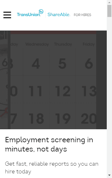
In the example below from ShareAble for Hires, notice how the reduced screen displays what the mobile version of the site would look like. The menu header is reduced to a dropdown, and the images become overlaid with the condensed header text displayed below. All the content is still the same, however, which is important for maintaining rankings in both desktop and mobile searches.
Full screen:

Reduced screen:

Responsive web pages are now easier to create due to the amount of templates that are readily available, but creating them from scratch requires a complex knowledge of CSS. Google has long recommended the use of responsive web design for mobile-friendliness.
Adaptive websites are created with different layouts depending on the size of the device screen. Typically, six standard layouts are pre-determined. When the site detects the browser size, it displays the corresponding layout. Because the site is often loading all of these potential layouts while waiting to determine the correct one, adaptive sites can often take longer to load, which can be a disadvantage in both rankings and maintaining traffic to your site – many users will exit a page that takes longer than a few seconds to load.
To learn more about the difference between responsive and adaptive design, check out this resource from CSS Tricks and this article from Medium Well.
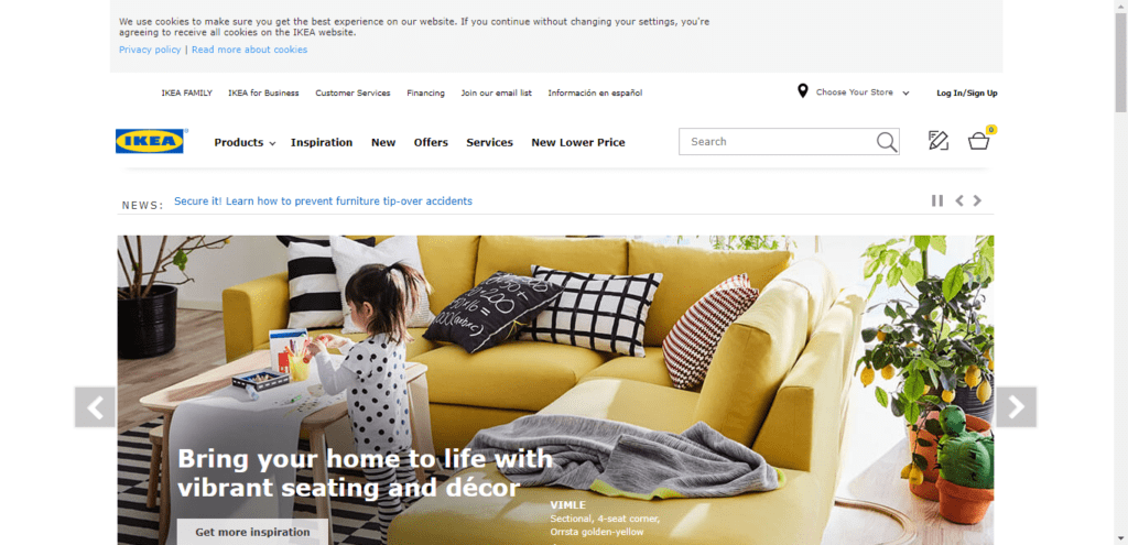
You can see adaptive design in action in the example below from IKEA. Notice how the site format does not change when the window is reduced:
Full screen:

Reduced screen:

But, when viewed on a mobile device, the design is appropriate to the screen size:

Mobile-Optimized Website Builder
Creating responsive and mobile-friendly websites has become even easier due to the rise of mobile-optimized website builders. These tools have become more prevalent as the demand for faster and easier-to-digest mobile content continues to rise. This technology cuts out the difficulties associated with building a responsive website from scratch.
This guide from Website Builder Expert compares three major responsive website builders. If you’re creating a new website, start there to determine what website builder will work best for your business needs.
Note: Speed is crucial for mobile optimization! Stats have shown that around 53% webpages are abandoned if they take more than three seconds to load. When choosing a website builder, make sure it doesn’t negatively affect loading time, as this risks losing visitors.
The Difference in Content
Mobile devices are used for various reasons – playing games, reading the latest news, tweeting updates, and even watching movies. Content marketing specialists need to focus on developing content that users can easily digest regardless of where they are or what they are doing.
For example, it’s pretty common to see people using their phones while traveling through the subway, or standing in line at a grocery store. These mobile sessions don’t last long, so it is crucial to produce high-quality content that is digestible. Not doing so risks losing visitors.
A major focus when creating content for mobiles should be to optimize it accordingly so that it is automatically mobile-friendly. Shorter headlines, strong opening sentences, optimized images, and more are all important factors in ensuring the content itself is mobile-ready.
Here are two examples of mobile-friendly blog posts:
In the first example, a post from SmartMove’s blog, paragraphs are no more than four sentences and the main points are separated by bullets.

In the second example, a post from Patagonia’s blog, there is a featured video and a change in text size to highlight a quote.

Conclusion
In 2017, over 80% of internet users accessed the web from a mobile device. This number is expected to rise in 2018, which, when combined with the rollout of Google’s mobile-first index, means developers and digital marketers should prioritize mobile optimization. This is a process that combines many aspects including responsiveness, speed, and high quality content.
With all of these elements in tandem, experts can create a mobile-friendly page that will rank better in SERPs and generate more traffic.

