Neuromarketing is the practice of applying insights from contemporary neuroscience and psychology in the field of advertising. It incorporates principles from social psychology, behavioral economics, game theory and other disciplines used in the study human behavior. It relies on the fact that human sensorimotor, cognitive and affective responses to marketing can be measured and turned into data. Marketers use it to design more effective marketing strategies. The term 'neuromarketing' has only recently gained wider acceptance. The psychological principles this practice relies on have their roots in the early days of the 20th century. Curious readers might find the works of Sigmund Freud and his nephew Edward Bernays, known as fathers of psychoanalysis and public relations respectively, to be particularly stimulating.
Neuromarketing techniques are used in all areas of business related to customer service, including web design. For example, the effectiveness of conversion funneling, the dominant marketing theory in e-commerce, relies on neuromarketing a lot. Neuromarketing is pervasive in modern web design, but this does not mean that marketers use it appropriately and effectively. Even large websites such as Facebook, YouTube or Reddit can stand to gain from extra neuromarketing optimization. Imagine what it does for smaller sites struggling to get ahead in search rankings. For businesses looking to optimize their online presence through scientific means, we have compiled a list of ways in which well-known psychological principles can be used to boost the neuromarketing potential of a website.

Photo source: JamescGunter
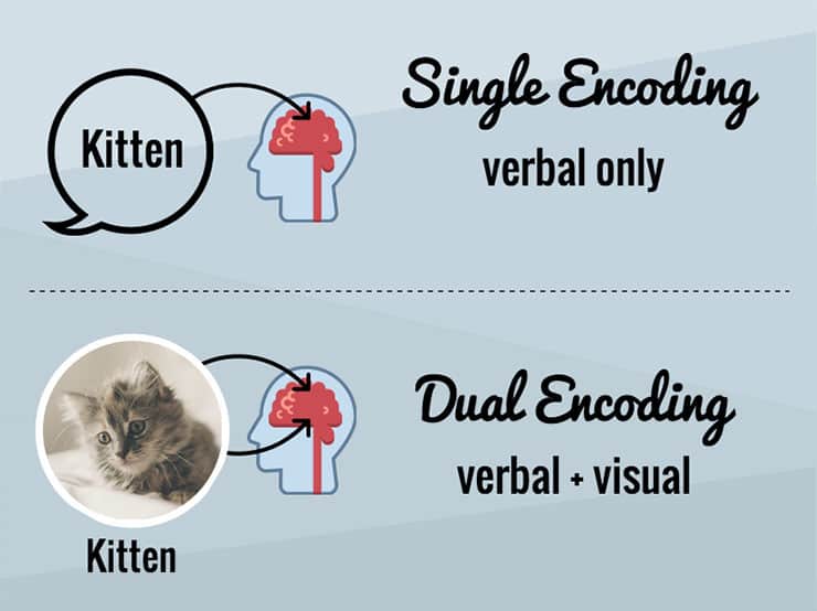
One of the oldest instances of neuromarketing is within the phrase 'a picture is worth a thousand words'. This common saying is based on the phenomenon called the picture-superiority effect, which just means that pictures are more likely to be remembered than words. All websites built on Web 2.0 standards use this effect to some extent. In recent years, using images when designing websites became a necessity as visitors now have shorter attention spans. With only about 8 seconds to catch their attention, modern websites have to condense information, and images are the best way to do this.
When people are unsure how to act, they are likely to mimic what others are doing. This is the logic behind social proof, the psychological principle where people tend to follow the crowd when feeling uncertain. Web designers implement this principle by featuring reviews, comments, testimonials, social media stats, etc. throughout a website.
The process of guiding a visitor through the conversion funnel is way more efficient when designers include social cues in each step of the process. Satisfied customers are more likely to add to the commentary themselves. This enhances the effectiveness of social proofing in the future.
Humans are creatures of habit, and this characteristic extends to the way they browse the internet. When visiting a website, their expectations on how it is supposed to function are based on previous browsing experiences. If these expectations are subverted, you are likely to confuse and frustrate your visitors. The psychological principle that explains this is called functional fixedness. It relies on the observation that people encounter a mental block when they should use objects in unexpected ways.
When applied to web design, functional fixedness dictates that elements which form the core functionality of a website, such as store interfaces, social media plugins, navigation menus, etc. should be designed to work in a familiar way. Sometimes, doing things the old-fashioned way is better than needlessly innovating.
Anchoring or focalism refers to the psychological principle which states that people tend to base their decisions on how to act on a single piece of information. In web design, this principle can guide the user towards a preferred call-to-action without directly suggesting it. For example, using the landing page to highlight that a service is usually available at a certain price range, contextualizes the visitor's expectations when he sees an offer of this kind while browsing the website.
Web design based around anchoring ensures that the context for evaluating an offer is determined in advance, leading to a more stable conversion process.

Photo source: Typepad
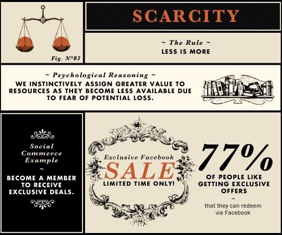
The perceived value of an item is dependent on the difficulty of obtaining it. This is the principle of scarcity heuristic, a cognitive bias where an item with limited availability is more desirable. Whether the sought-after item is actually scarce or not is irrelevant, as long as the implication exists. Web designers can leverage this psychological quirk by using alerts mechanisms to highlight the limited nature of the services they offer. Countdown timers in the header of a page and brightly colored inventory counters are an example of this kind of design at work.

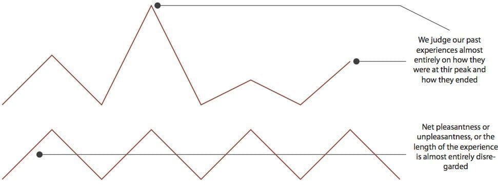
Visiting a website is an experience that lasts a certain amount of time. During this period, the intensity of the experience can rise and fall. Visitors might like the discounts you are offering, but hate how sluggish your store page is. The structure of these fluctuations is what determines whether the experience will be remembered as a positive one or not. Research has shown that there is a pattern in the flow of experience that determines how it will be remembered. What people experience at the peak, as well as at the end, is what determines their feelings as a whole. This so-called peak-end rule is an indispensable tool in website development, as it allows designers the optimize the UX of a website for the most impact. In other words, make sure that your highs are really high, and that your lows are unnoticeable.
Taking a cursory glance at the history of advertising, you will surely come across many examples of marketing slogans. These short rhyming phrases tend to become annoying after many exposures, but their efficacy as ear-worms is a well-documented fact. People are more likely to believe a statement if it is in rhyming verse.
Maybe because it's easier to processes, or because people tend to judge statements more favorably based on their aesthetic features. Using rhymes when designing the textual content can give a website a unique twist that separates it from rest of the competition.
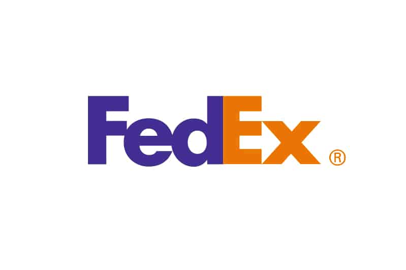
One can use neuromarketing even when dealing with logo design - something that seemingly presents a minutia when it comes to designing a website. However, it is a great way to solidify the importance of your brand in the brains of your customers. Research has shown that a clever logo with a subtle message, that communicates your brands identity and purpose, can be processed by our brain without us being consciously aware.
Take for example the logo of FedEx, when you look closely, there is an arrow between “E” and “x”, obviously, it’s there to represent the speed of their service.

Despite what it sounds like, neuromarketing is not an esoteric discipline with limited application in the real world. It is based on well-known psychological principles with a wide range of applications. Designing a website with neuromarketing in mind is no different than setting a price of a service based on market research. No matter what kind of business you are practicing, using neuromarketing principles is indispensable.