The goal of your contact page is to convert site visitors into leads. However, if your contact page falls flat, those same visitors might bounce away and wind up on your competitor’s site instead.
A typical conversion rate on a contact form is a mere 3 percent. However, there are some things you can do to up that percentage for your own site and to ensure those leads are the highest quality possible. Here are nine strategies to ensure you get as many leads as possible from your contact page:
One of the first things you should do is look at how many fields are in your form. Statistics show that the more fields for the user to fill out, the more likely he is to abandon your contact form. Reducing the number of form fields to less than 10 increases lead conversions by 120 percent, and reducing the number to four or less takes the conversion rate up to 160 percent. It is worth your time to figure out what information you truly need and what you can do without for now.

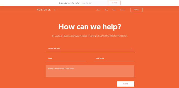
Marketing guru Neil Patel has a fairly simple contact page that still addresses the needs of his users. You simply tell him why you’re getting in touch, add your name, email and notes if you’d like, and you’re ready to submit. This allows for some customization, while not requiring too many fields to fill out.
This might sound obvious, but it is a step many website owners overlook. The form likely works great on their end, because they are logged in as an administrator. However, does the form work for someone without a username on your system? Take the time to thoroughly test everything on your contact page. People can’t get in touch with you if the forms won’t work.
Make sure you offer some sort of confirmation that the form has been submitted. Otherwise, even if the form is working, the user may suspect it isn’t. This can translate into multiple submissions and frustrated users. Make sure when the site visitor clicks Submit that a thank you/ your form has been submitted message appears. In addition, you’ll want to set up an autoresponder that will generate a thank you email and let the user know you’ll be in touch soon.

The Kentucky Guild of Brewers has a simple contact form where you fill in your name, email and basic message. Once you hit submit, you get a “Thank you!” message. This lets the user know the form has been submitted. They then follow up by getting in touch with the person within short order.
Explain to your site visitors why they should contact you. This might be an offer of a free guide, a note about your expertise and that you’d like to share it, or some very specific reasons the person might want to get in touch. Make it easy to get in touch with you and users know you’d like for them to make contact. Sometimes they just need an invitation.
Offer the user more than one way to get in touch. No matter how much testing you do, there will be a browser or system on which your form doesn’t work well. Some people simply don’t like or respond well to forms, either. Instead, also provide an email address and perhaps a phone number. The more ways a user has to contact you, the easier the entire process becomes and the more user-friendly your site.

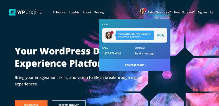
Take a look at how WPEngine creates multiple opportunities for contact. First, it has a live chat window that pops up. However, if you prefer not to live chat, you can simply send a message or call. If you click on Send a Message, you are taken to a contact form. On the right is additional information, including an email address and physical mailing address, as well as a repeat of that toll-free number.
People aged 18 to 34 are more likely to follow a brand on social media than other age groups — about 95 percent of them follow brands on social media. A good place to add social media follow buttons is on your contact page. Some of your customers might prefer to contact you via social media channels. As a bonus, they will likely follow your brand, allowing you to market to them in the future.
Don’t just push your contact form down to the bottom of your page and leave it there. It might be better to have it above the fold, even if you need to put it on a separate page. Even though placing above the fold doesn’t ensure your form will be viewed, the engagement rates for items above the fold does peak. The best way to engage users is to convince them to take action.
Have you ever tried to submit a form, but you can’t figure out what the CAPTCHA code is? This is quite frustrating to the user. Some CAPTCHA forms use images or scrambled letters and numbers that are very difficult to read. If you must implement a CAPTCHA, keep it as simple as possible. One good choice is a check box next to the words “I’m not a robot.” In one study, CAPTCHA created a conversion rate drop of 3.2 percent, which can really add up when form submissions aren’t very high to start with.
Make it easy for the user to find your privacy policy. Some people are reluctant to share their information because it has been abused in the past. No one wants a bunch of spam filling their email inbox, so people tend to be really protective of their email addresses. Show them they can trust you not to sell or share their information and they’ll be more likely to share it.
Everyone loves to generate more leads, and following the tips above will help you generate quality leads. A contact who is interested in what your business has to offer is worth far more than one that simply clicked on the form in order to enter a contest or get something in return. Cultivate the target audience you most want to reach, do split testing until your contact page is performing well and increase your conversion rate more than you thought possible.