We all know it, you work on your site, carefully plan the traffic campaigns, and finally start getting visitors to your web, just to realize that the lead conversion is just not there.
Sure, you could concentrate on the volume and try to bring even more traffic, but increasing traffic by 50% or by 100% is difficult, time-consuming, or too expensive.
On the other hand, improving your on-page lead conversion from 1% to 2% can be a matter of a change of color, repositioning of the button, or a more sophisticated sales statement.
In this post, we will target exactly that, how to improve your on-page lead conversion, and leverage the incoming traffic to the max!
While this is of course more of an overall tip, you would be surprised how many marketers are startled by the question “What is the goal of this page?” Many will you “To Convert” but convert to what?
The list goes on. On your sales funnel you must identify where the page stands.
Is it a cold lead page? In that case, you may just have a two-row email opt-in with a freebie.
Should the result be a qualified lead? For this situation, you are probably looking for more information from the visitor even for the sacrifice of the volume. You will receive fewer leads but more of them will be qualified.
Setting your goal for a particular landing page is a key ingredient in improving your lead conversion.
You have to challenge the status quo from time to time. It may seem that the landing page is working well, but there is always space for improvement.
You can start with testing with colors and moving some of the boxes, but if you are looking for a total overhaul you may want to use the landing page builder. These tools will allow you to easily create several variations of your landing page and switch seamlessly between them.
Only after you will be able to make such overhauls with just a couple of clicks you will really start experimenting with various designs.
Let’s have a look at some areas which you can concentrate on when considering an A/B test on your page:
You may want to consider a complete change in the layout of your page. If you have an older web that should be updated this would be one of the situations for a complete layout change. It is possible that your page does not allow you to include the modifications you are planning to make.
In some cases is possible that you see your page conversion rates slowly dropping. The market is moving and so should you. Here are some examples of the major sites and the changes they went through in just 5 years.
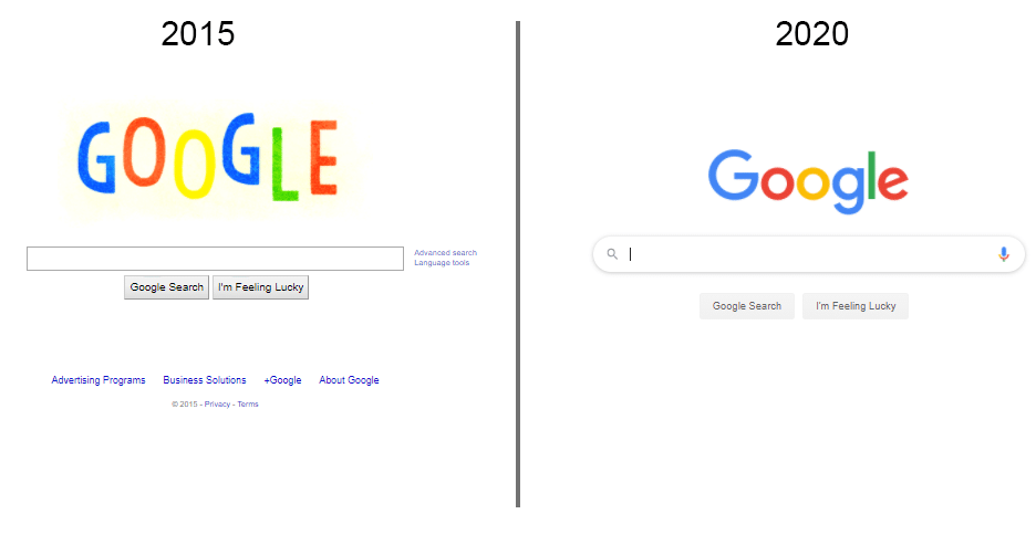
While this may not seem as much, such a change is huge for Google. The search bar is the alfa and omega of their business. So they took away the things that might disturb you and left just the bar, so you can quickly concentrate on your search.
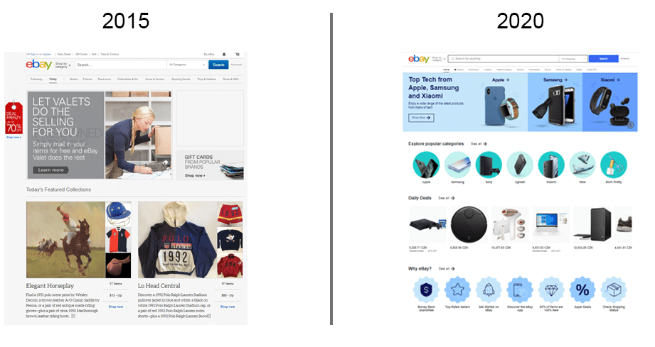
Imagine how much testing and risks are to be taken to completely change the main page of eBay as you see in the examples above. eBay receives around 900mil views a month, and they completely changed their layout.
Ahrefs, which is one of the best online marketing tools, recently rolled out a completely new copy on their homepage. They claim they’ve spent over $33k on the copy, and did not do any A/B tests. While their argument on ignoring A/B testing s very interesting, let’s concentrate on the copy factor.
Copy plates a key role on your page, even better than design. While a good copy will save a bad design, a good design can not save a bad copy.
If you do not want to completely redesign the page, or just do not have time or resources to do so - consider updating/refreshing your copy.
Every couple of months market moves and you become a more experienced marketer. When I look back at posts I did 12, 6, or even 3 months ago - I see a lot of space for improvement.
I am not talking about changing “Join” to “Subscribe” and expecting a revolution in conversion, but really reworking the whole page.
When changing a copy you have to properly test it, or commit to the new one (as Ahrefs did). You can not test for a day or two. In order to get serious results, you need to leave the new copy running for several months. Only after then you can compare the engagement.
Check out your top competitor and see what they are doing differently than you. For eCommerce, product sales, or service goals it could be:
If your goal is to step up your progress in email marketing and you are looking to increase your email conversions, possibly you need to change the offer on your opt-in form, for example:
An important step to consider when improving lead conversions is of course the CTA which is also our next point.
Do not be afraid of asking your visitors to do the action that you need them to do. If your CTA will be in a grown color somewhere in the corner, no one will see it and you are just losing the visitor.
Improving CTA is not just about switching places, changing shapes, and making a couple of color variants.
A good example of a clear CTA is Mailshake Outreach Automation:
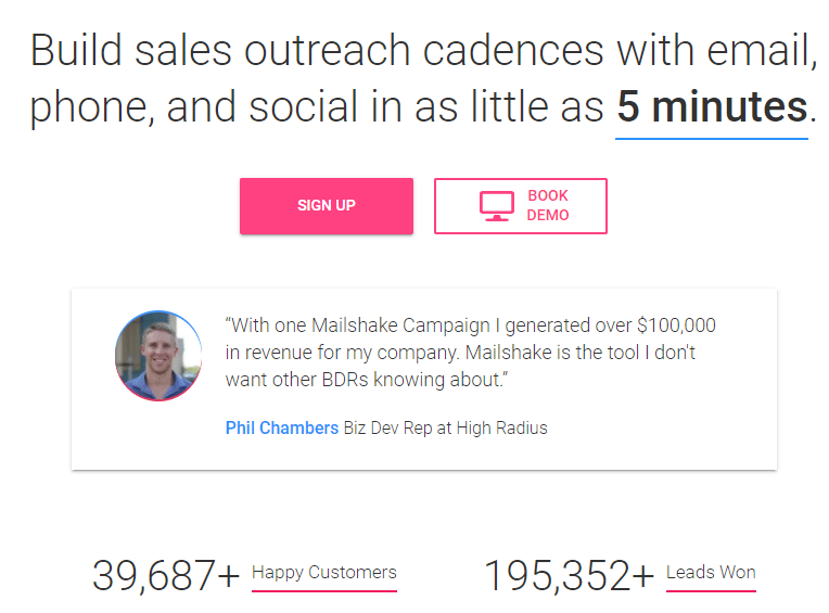
This is a portion of their main page. Let’s analyze it.
All your problems will be solved in 5 minutes. If somebody was looking for “email automation, “outreach automation” or “Mailshake” they were trying to solve a problem of the time spent when sending out emails manually.
Mailshake has only one product. So when visitors land on the page, it is obvious what they are looking for. Mailshake leverages this product's simplicity by immediately telling you that the problem you have will be solved in 5 minutes.
Right under it, we can see a strong testimonial. Phil Chambers was able to get $100,000 just from a single Mailshake campaign. The wheels in the visitor’s head start rolling - what if you make 2 or three campaigns?
There is a picture, full name, position, and company. Making it trustworthy and believable. This helps visitors to connect with the author of the testimonial.
To make sure you have all the proof you need to make an immediate decision, Mailshake shows the numbers of their clients and the total leads it generated. The numbers are impressive and give you additional reassurance of the quality of the service.
Mailshake already has quite a contrasting color - purple. But notice the very good use of it. Other colors are non-existent on the page. There is slight use of blue but otherwise just white, making the purple pop out even more.
The white space also makes you concentrate on the things that matter. They are not taking your attention elsewhere.
When using colors, make sure to use a “hot” color. Red and Orange will always perform better than blue and green.

In this simple color test, Dmix found out that just switching the button to red improved the conversions by 34%.
Visuals represent a major part of the lead conversion success, and it is important to pay separate attention to them.
Do not just use any stock image that you will find. Make sure that the image resonates with your offer or is complementary to the overall theme of your site. There are plenty of places to search for free images for commercial use:
Just to give you a few, there are many more sources such as these out there.
Never use images with bad resolution or images that are not properly cropped. Each such mistake is making a dent in the overall authority of your copywriting as it gives the sloppy unfinished feeling.
This great example comes from store:
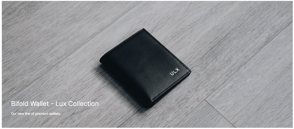
Followed by a “detail and in use” picture:
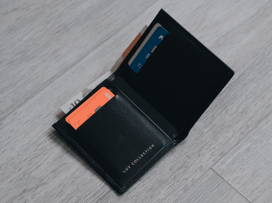
This is particularly important if you have a product page. Show the product in detail and show how it is used, possibly by your customer.
Consider using pictures with faces, just make sure that they do not look like stock photos and are somehow relevant to the overall theme.
Just by putting a picture on your product page or a customer service page, you can increase conversions by close to 20%.
If you want to draw particular attention to a point on your page, you can also do so with images.
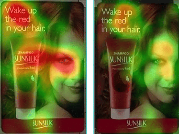
This study has proven (again) that you can guide the visitors’ attention with the correct eye position of the “hero shot” Make sure to consider that when making a redesign of your landing page.
opt-in bars are email opt-in forms positioned on the top or the bottom of the page. The opt-in bar may also be floating, following you when you scroll or appear at a particular time.
This is an example of an opt-in bar on Brian Tracy's page:
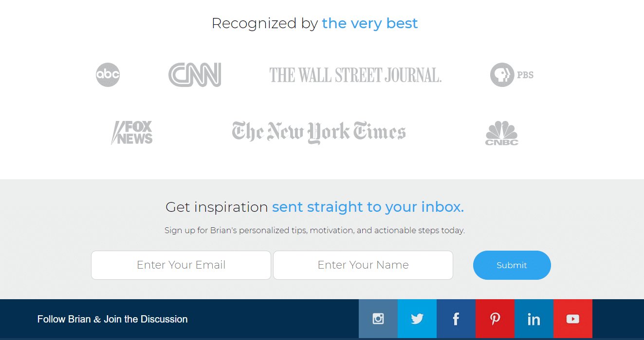
The goal is convenience for your visitor. Visitors will not return to look for the place to put their email in, so you must place the possibility to leave their contact through the page.
There is a thin line between convincing and irritating. Do not overdo it, one bar for the whole page is enough to complement the opt-in form on the side menu or in post. Additional opt-in popups, float-ins, or scrolling bars would just deteriorate the users' experience.
An exit popup is triggered when visitors' cursor gets from the screen frame. Alternatively, it can be triggered after a particular amount of time (that would not qualify it as an exit popup but the logic remains the same).
To give you an example right from the source, Optinmonster has this full-screen exit-intent popup when you point your cursor away from the site after some time:
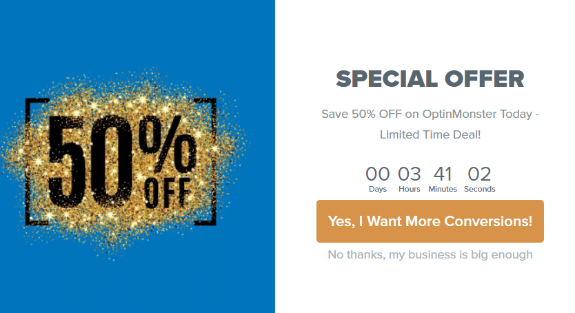
As you can see there is a very interesting offer. As this popup appears only if you spent some time on the site, Optinmonster is trying to catch visitors that were interested in their product but are now leaving because they are on the fence.
To help them make that final decision they are providing a notable discount and adding a clock for the sense of urgency.
Notice that the CTA button is not a “Yes”, “Buy Now” or “I want The Discount”. It speaks directly to the business of the visitor. Same as if it would be saying “Yes, I want $1,000 Now”.
You can expand to other popups as well, there are a wide variety of choices of popup placements and templates. No coding skills are needed, so you can experiment very easily.
As with the landing pages, make sure to A/B test your popups from time to time. While changing the whole landing page is a big project, switching between various popups is a matter of a couple of minutes.
Imagine if you click on a link about cats and get to a landing page about fitness programs. You will be out from the page in a second and no images or exit popups will stop you.
If you are just starting, you may have a feeling that you just need to throw volumes of traffic on your page, no matter where it comes from. Anything to get those cheap clicks and see how your Google Analytics is growing. If those clicks are not converting, you start optimizing your landing page.
That is the wrong approach. Right from the moment the user sees your link, ad, or a piece of content to the moment of conversion everything should be coherent and in full harmony.
Your title, h2, and h3 tags, and a meta description should all be in line with your goal. You know that Google is not ranking just based on keyword richness but search intent. That is your goal too. You want the SEO of your content to be in line with the search intent you are looking for. For instance my post on the best webinar services:
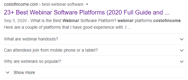
While meta is sometimes tricky to directly influence, there is much less work to be made when a visitor clicks. The title explains in detail what the post is about, so if they click - there are no surprises. The search intent is fulfilled. The FAQ section is reflected in Google, so users can have an answer to some of their basic questions.
If they come on the page there is navigation to lower the bounce rate (as it is a longer piece of text.):
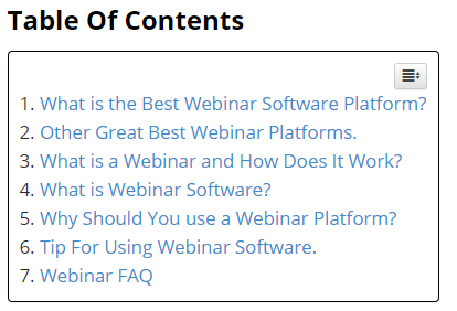
The average time spent is over 1 minute 35 seconds, which is exactly what I was looking for.
The first impression is created right at the doorstep, so do not forget to keep your content optimized. If not for Google, then for your visitors. They are much more likely to convert if they received the answers that they were looking for in the first place.
With giveaways, you are completing two tasks with one strategy. You are both increasing the number of visitors, followers, and subscribers while at the same time increasing your conversion rates.
Here is how it works. You launch a campaign asking your visitors to do something and promising that you will choose a winner from those that did tasks. You limit the time and at the end of this period, you choose the winner and them the prize.
Every step is promoted on social media for better engagement. You take a statement from the winner to make sure that even more visitors subscribe to your site. There are many giveaway examples, but what does it have to do with conversions?
The task is usually subscribing to or following your social media channels. That is why giveaways and various contests are gaining popularity.
Let’s say you have a product or service. You launch a giveaway saying that you will give out a 3 x 3 month free trial for your product to 3 lucky ones who subscribe to your list, fills out the form, or do anything else that you need to do. It might be a combination of tasks. For example email option and Facebook page subscription.
For the users, leaving their email and following you is not a big deal compared to the potential prize that they may win. So with this strategy, you are promoting your product, page, or service while at the same time getting leads for your sales funnel.
Most importantly - this of course significantly increases your conversion rate. Even though it is just at the time of the giveaway. But what is the difference between giving out a free report of 3 months of free product use? It is all a freebie for the users to convert, so leverage it to the max.
As you have seen from our tips, the perfect lead conversion rate is hard to achieve. There is always something to improve.
In addition to that, the digital marketing environment is constantly changing. New competitors are coming every day. It is not possible to hold any kind of status quo, you have to constantly develop and move forward.
That is why if there would be one suggestion that we would like to leave you with it would be testing. You never know how something would work for you until you try it and it is much better to try, fail, and try again than to never try at all.