There’s nothing like a good infographic about good infographics.
And that’s exactly what Siege Media is serving up with its new study, The Science Behind the Most Popular Infographics.
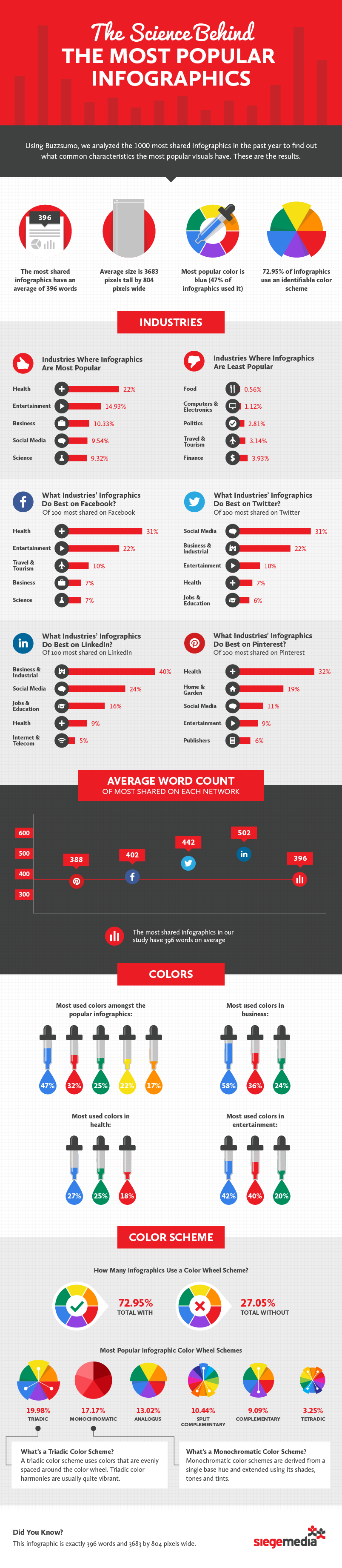
In partnership with Buzzsumo, Siege analyzed the 1,000 most-shared infographics of the past year to find out what they had in common—and what advertisers can do to make their multimedia assets more shareable.
So, what did the agency dig up? Let’s just say this: Before you start stressing over the actual content of your infographic, there are easy format and distribution tips you can use to make your infographics pop.
For instance, on average, the most popular infographics include 396 words and are 3683 by 804 pixels wide. The most popular color for infographics is blue, and the most common colors across the business, health, and entertainment industries are blue, green, and red.
Speaking of industries, infographics about health do best on Facebook and Pinterest, while infographics about social media are shared more on Twitter. Additionally, you might be able to get away with wordier infographics on Twitter, seeing as the most-shared infographics on the platform average 442 words.
To find out more for yourself, check out the infographic below. Oh yeah, and in case you were wondering, “The Science Behind the Most Popular Infographics” is exactly 396 words and 3683 by 804 pixels wide. So meta, much clever.
[xyz-ihs snippet="Hubspot-CTA-Leaderboard"]