It's common for marketers to make a whole lot of fuss about timely deploying well-crafted email marketing campaigns. The hubbub is justified! Without the right promotional email that carries well-placed CTAs, it becomes exceedingly difficult to get prospects to a desired website landing page.
Marketers are well-aware of this, so they put forth gargantuan efforts in personalizing a top-notch marketing email but still experience low conversion rates. This typically happens when the CTAs present in marketing emails redirect leads to poorly designed landing pages.
An unflattering landing page linked to an exceptional promotional email can severely hamper your brand's reputation and shake your lead's trust in your product or service. Moreover, given that landing pages alone are responsible for a 9.7% conversion rate, it's prudent they be well-crafted.
Are you wondering if there is a talisman, perhaps, a bag of tricks that can help you create elusive email marketing landing pages? There's nothing magical about it. Just follow the seven tips listed below.
Remember: Your leads are coming to your landing page after having read the email you sent them. So they already have a firm idea of what to expect from a subsequent landing page. Therefore, you must offer them continuity, something achieved only with the right headline.
Here are a few practical hacks to keep your landing page headlines engaging:
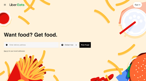
In a nutshell, since the headline is the very first thing your prospect will look at, make sure it's powerful. For example, if you're a food delivery app such as Uber Eats, your landing page must state what you do right on top. Here is their straight-faced headline approach, ironic with a hint of wit: "Want food? Get food."
Write powerful body content for your landing page that further elaborates on the information your marketing email provided to the reader. For instance, if the lead has come to your landing page by clicking on an email that contained a CTA to buy a SaaS CRM software, don't greet them with a description of what it does.
The page should, foremost, contain a headline saying something like "Make your CRM software purchase in less than 30 seconds." The body content should mention the software name and image with a single CTA saying "Buy now."
Keep the body content of your landing page relevant and concise. Provide only critical information. Remember, this is not your product's home page and must not be treated as one as that would annoy your prospects and thwart conversion.
Just as you would use a CTA in your marketing email, make sure your landing page also carries a powerful one. But only one, at least in the top section of your landing page.
If you use more than one or two CTAs, you risk confusing the next step you want your prospect to take.
Instead, include a single powerful CTA that quickly catches your reader's eye. Be it to directly help them buy your product or service, educate them, or invite them to start a free trial. Whatever the next action you want them to take becomes your singular CTA.
Once you're done writing the top half of your landing page, you can utilize the rest of the space to describe your product features further, put out a chatbot for customer service, and so on.
If you think appearances are unimportant, think again. A visually cluttered landing page with a jarring color scheme and upper case letters reduces a brand's credibility. It almost makes the landing page seem like a spam scheme. Why would any prospect buy from a page that looks "shady" to begin with?
Avoid such a scenario by adhering to the following tips that top UI designers use to make a web landing page aesthetically appealing:
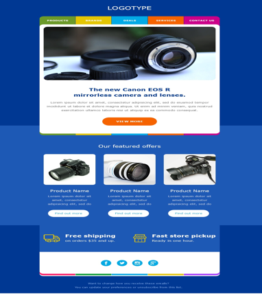
Here is an email template that doubles up as a landing page created by automated email marketing software SendX. Look at how it strikes the right color balance, has a single CTA in the first half, and uses stellar imagery to describe the product, in this case, a Canon camera.
A great many brands make the mistake of filling their landing pages with non-CTA links such as social media buttons, navigation bars, or links to other products they offer. These practices are suggestive in nature and often distract a prospect from converting.
Your landing page should ideally only contain the information you advertised in your marketing email. However, your website will contain a top menu bar, which visitors can use to explore your home or other pages. But that's all you should provide. Better yet, leave the landing page with nothing but a home button on the top left or right corner.
This tip is especially useful if your landing page launches a new product or feature. Providing social proof in the form of customer testimonials or reviews can help fence-sitting leads to take action. It just may be the final straw for converting them.
The logic here is simple. Anyone can send a marketing email talking up their product, but this doesn't guarantee that your potential customer will believe you. This is why your landing page is an ideal place to showcase positive customer feedback given by previous buyers.
While you may be happy with the landing page you designed, your potential buyers might not click through it. Perhaps they found it confusing. Create at least two versions of a landing page based on what your leads might like and A/B test them with a small prospect sample.
Doing this will yield quick results as to which one fares well. You can also use a web analytics tool to study how much time prospects spend on a particular landing page sample and on which section. Keep in mind that testing your landing pages before rolling one out can boost conversions by a whopping 300%.
If you're struggling to craft the perfect landing page, one that truly complements your email marketing campaign, these seven tips can serve as a blueprint. Use them to develop a landing page that's a natural extension of your marketing email and provides actionable information to your prospect.